Donation Form Optimization
Turning “Good Enough” into Record-Breaking Results
Donors Were Ready—The Form Wasn’t
Despite a strong brand presence and loyal donor base, the organization’s digital giving experience wasn’t keeping pace. The donation form was converting at 14%—a number the team had long considered “good enough.” But as acquisition costs rose and donor expectations evolved, it became clear that leaving the form untouched meant leaving real revenue on the table.
Data Doesn’t Lie—Friction Does
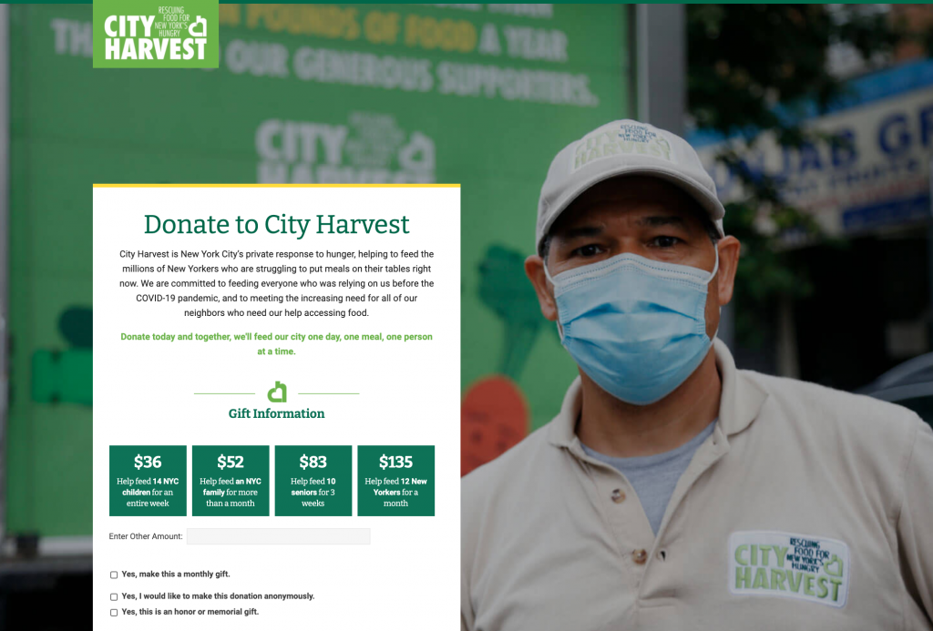
We redesigned the donation flow from the ground up—simplifying fields, refining mobile usability, and aligning copy and visuals with the donor’s motivation to give. We applied data-driven testing to optimize each element, from button color to suggested gift amounts. The goal: reduce friction, elevate trust, and make generosity effortless.
AREA 1:
Create a clearer path to the donation form, which included:
- Campaign-specific homepage banners containing “GIVE” CTAs
- Campaign-specific lightboxes with a “GIVE” CTA for the top pages with a once-a-day cookie for the duration of the campaign
AREA 2:
New Creative Specs for the Donation Form
- Matched up the DF layout with the current website header/footer template
- More compelling design with strong imagery
- The actual form appears above the fold of the fold on a standard 13” screen size
- Included key organizational messaging
AREA 3:
Designed new Technical Specs
- Built new template on a separate subdomain
- Embedded donation platform form on the new page
- Adjusted form fields for best-practice configurations and overall look and feel
From 14% to 38%—Instant Lift
The impact was immediate. Conversion rates jumped from 14% to 38%—nearly tripling the number of donors completing their gifts. Combined with broader awareness efforts during an uncertain economy, this optimization delivered millions in previously unrealized revenue—proving that even “good enough” can still leave tremendous value untapped.